Friday, 26 February 2010

Magazine Front Cover Analysis


Film Magazines are another tool used by film companies to promote their films. Total Film is a popular film magazine that usually features a 'cover movie' on its front cover, this featured movie often has a prestige's actor, director or have recently won an award. If the film is featured on the front of a popular film magazine then the readers will more then likely think of this film as important, combine this with a good review and the reader will therefore be more likely to go and see the film. However if the film receives a bad review from a magazine or in fact any medium then the opposite effect could come into play and the reader may be put of seeing the film in question.

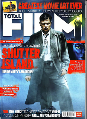
This particular front cover features the movie 'Shutter Island'. The focal point of the magazine is fought out between the big, bold, bright red text, in the eeire San serif font stating the name of the film, 'Shutter Island', and the main image of the popular actor Leonardo Di Caprio. The big bright red coloured text acts as a motief, symbolising danger, the way it overlaps over the image of Leonardo Di Caprio interlinks the two features and suggests that Leonardo Di Caprio, within the film is going to be in dangerous situations. This ideology of eeriness and danger portrayed in the colour scheme is again evident in the background image and colour, blue mist and dark sky's are shown, these colours & images again, give the idea that something is wrong. However the lighthouse image in the top right corner projects a small amount of light into the dark mist of night, symbolising that there is also an element of hope within the film.
All of the normal conventions typically found on a film magazine front cover are found on Total Film. It has a big, bold masthead proclaiming which magazine the reader is looking at, it has puffs located down either side of the cover and has tag lines running across the top and the bottom of the page, a barcode is also included. The only other feature of this cover that is relevant to the main film that it is advertising, apart from the central image + name of the film is the two puffs in white coloured text on top of and below the title "Shutter Island". These puff's give a small hint to the reader of what the films basic plot/location, while at the same time providing a small amount of humour and intrigue in the way that the puffs have been worded into puns relevent to the plot line.

The final point i wish to make about the cover is synergy. Synergy is the idea of making all things related to an idea you wish to portray follow the same set of ideals or same style of image, with the objective of improving its effectiveness. In terms of the Shutter Island promotional campaign allot of the Mise En Scene is the same for example the the clothes the main character wares are the same on the film magazine cover and the trailer in some parts. The colour scheme of the poster, cover and trailer are in allot of places the same, in terms of the red motief and the dark eerie colours.
Overall I think that this magazine front cover is effective in both selling the actual magazine and also promoting the "Shutter Island" film to potential customers.

In an attempt to keep my research of promotional campaigns consistent i tried to find a magazine cover featuring the film "Cloverfield", unfortunately i was unable to find such a cover, therefore i chose to analyse a front cover from the popular (2.5m circulation) American 'Mans Mag' "Maxim" featuring the 2006 summer blockbuster "Snakes on a Plane". I chose this film because it is relevant to Cloverfield in terms of its promotional campaign, starting Virally, also the fact that Maxim is targeted at young men it will hopefully provide an interesting contrast to the conventional 'film review' magazines, therefore increasing my knowledge of different mediums within the media.


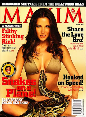
The main image for this cover is clearly designed to attract the male gaze. It includes an attractive woman and an exotic animal. The exotic animal in the form of a snake has been included to make the cover more exotic and also to promote the film snakes on a plane because snakes are highly featured in the film itself. One of the other main features of this cover is the puff displaying the critically acclaimed act Samuel L Jackson, this further more promotes the film as 'Star Theory' suggests that people are allot more likely to buy a piece of media if a celebrity with a good relative reputation is shown in the advertisement.

Seeing how MAXIM is a 'man's mag' the attractive female is included to gain the target audience's attension, other conventions of this genre of magazine are shown in the colour scheme, puffs, tag lines and masthead. The puffs and tag lines carry innuendo's, the masthead is clear and the colour scheme fits in the exotic 'Latino' feel of bauge pottery type colours and bright red.

Typical conventions found in nearly all magazines are also found on these particular one. For example a bar code can be found on the bottom right corner and puffs are found parallel down each side of the main central image. .

Overall I believe this cover of Maxim magazine does a good job in targeting its audience as well as promote the film Snakes on a Plan. The main advantage of Snakes on the Plane being advertised on this genre of magazine is that it promotes the image that the film is 'sexy' which plays into the idea of 'sex sells'. This tied in with the relevant target audience of young male for each product (film + magazine) and typical conventions being used to their full potential makes, in my opinion this particular cover a success in terms of raising the films profile and selling magazine copy's.


This film magazine front cover is another cover from the company Total Film, the difference with this cover however is its that it is the cover of a special edition. This idea is a very interesting to me because it is an edition that follows typical conventions of other covers while also containing unique special edition conventions. One of the most notisable conventions found on this 10 year special ediction of the Total Film magazine is colour scheme, alot of the puffs are colour bronze which is the steriotypical colour to sybolise 10 years of mariage, which gives of a positive imagary and at the same time gives the cover more 'prestiege'.

The tabs sown the side of the cover are another interesting convention used as they tell the reader/potensial reader, in a clear way what roughly is going to feature in the magazine without them ahving to flik through the product.

Tuesday, 23 February 2010

Film Poster Analysis


Shutter Island as of this date is a film yet to be released. The film company are currently in the stage of marketing the film before its released with the purpose of persuading people to go and watch it. They have released a film poster and a trailer which are two typical marketing ploys used with in the industry.

The focal point for this poster is the main central image. This image is of the 'star' of the film Leonardo Di Caprio holding a match to his face above an ominous looking prison (for the criminally insane) surrounded by stormy sea's. The film company will have spent millions of dollars on hiring this famous actor to star in their film for the main reason that there is a very large amount of people who will go to see a film based on whether or not their favorite actor is in it, an idea reaffirmed by Richard Dyer's Star Theory.

The picture does another good job of selling the film by in a way giving the potential customers a small idea into what the plot/genre of the movie is; the very bleak looking prison, dark colour scheme and stormy sea's suggest turmoil and unrest, this being emphasised by the tag line of "Something is missing". Leonardo Dicaprio's facial expression also ties in with this tag line and also the fact we can only see his face via the light from a match which again ties into the tag line because the question arises, why does he have to resort to the light from a match in order to see? It is questions like these that this poster does well in making potential customers think, adding intrigue and a sense of mystery to the film which is a popular way of marketing a film especially a film under the horror/thriller type genre.

The Second focal point of this poster is probably the two piece's of text coloured in red. Red has certain stereotypical connotations, such as murder (blood) and danger. This colour goes against the colour scheme of the poster and therefore stands out to a potential customer, the connotations associated with the colour also, again tie in with the tag line of something isn't right, again, adding intrigue and a sense of mystery about the film. The highlighted text is arguable the most important part of the poster, the text of the poster it contains the name of the film and its date of release, important piece's of information for selling a film as it is helpfully for the potential customer to know this if he or she wants to go and see the film (the purpose of making a film poster).

The final feature of the post is the billing block, this is a very standard convention used on film posters, it contains the names of the production company's, star actors, director and other varies important names. The billing block is in small compact font so not take away attension from the main points the poster is trying to make and the films selling points, this feature makes the film poster look more professional, the production company's names and logos often reassure a potential customer that the film will be of a good or high standard.

Although including the billing block, name and date of a film is a very commonly used convention when a film poster is produced, it is not included on every other similar media text. Posters in which these pieces on information are missing are sometimes known as teaser posters used in viral marketing campaigns. Viral marketing within the film industry is a type of marketing that does not comply with typical conventions, its aim is to familiarise people with the concept of a film getting people talking about it without knowing what it actually is. This type of marketing usually takes a long period of time, can be cheaper and if done correctly and can generate a large amount of excited people so interested in what viral advert mean that they will actually go to see the film without even know anything about it and regardless of its ratings and what critics say about it. A recent and very good example of this type of marketing within the film industry is the film Cloverfield. It used viral marketing 6 months prior to its release, this campaign was so successful it generated alot of attention from the media, which helped the campaign reach more people then it could have on its own. Examples of the Cloverfield teaser poster is shown below.


The teaser poster for Clover Field is very primitive in terms of details, the posters pretty much consist of a surreal main picture that slightly confuses the viewer. The only other consistent detail included on the posters is the data of the films release, this combined with the surreal main image will make viewers/potential customers think of questions and increases their intrigue in whatever is going to happen/be released on the data specified. These posters have been re-designed to a final poster the closer it gets to the date, including more details and stereotypical conventions such as billing blocks, names of staring actors and companies associated with the film. This has been done with the intension of converting any potential customer intrigue, into them actually going to see the film.

In conclusion from my research into film posters, i feel that i now have a greater understanding of the stereotypical and non stereotypical conventions used in these piece of media text and will certainly implement some of these features into my product after i have completed my research stage and my planning stage.

Next i will be carrying out research on film magazine front covers, the conventions used and the effects this form of advertisement have on the potential customers and the companies trying to sell the film.

Friday, 5 February 2010

Introduction

Hello and welcome to my blog, during the next few months i will be updating this with regular posts including details of my coursework and the research i have done. My overall aim is to provide a portfolio of my work, for the readers to clearly understand how i have completed my coursework and how it has developed over time. If i have achieved this by the end of the allocated time i will judge this project to be a success.

The brief i have been given consists of creating an original, 2 minute teaser trailer and a poster with the aim of advertising our made up film. Primary and Secondary research aimed at my target demo graph will be used throughout the task to shape what the final product will look like.
My intentions are to successfully create a product that fans from a specific film genre can identify with, it will have to include techniques and features relevant to the genre, while being original in its own way.

The first thing I intend to do is start the research on film trailers and posters by looking at existing products from companies such as 'Shutter Island' and possibly, products from media outlets such of 'YouTube.com'/ This will hopefully give me a better understanding of the conventions and features that a teaser trailer and film poster's typically include.

Finally on the subject of research, i plan on carrying out as much of it as possible, this is because as of now, my knowledge of conventions, camera angles and editing techniques is limited. I believe the best way of doing this would be to analyse existing products and point out the reasons why certain features where included. By doing this i will hope to achieve a better understanding of what appeals to their customers and implement some of these idea's into my/my groups own creation.